The Concept
The Productivity Lab is a new project from myself and co-host Kyle that puts different productivity tips, tricks, and books to the test. While the project has launched, I thought I would share a design exploration before handing it off to someone much better than I.

The project started with some sketches and theme words. I made a note of what Kyle and I were feeling about the project and then I sketched out different designs for the logo. I don’t get to do this much but it is extremely fun to start a design exploration to see how much can change and what you can create.
Keying in on the few we liked, I scanned the sketches into Adobe Illustrator, which was a first for me, and attempted to vectorize it. This was a great exercise of skill despite how simple the works were. After some time figuring out Illustrators tools for vectoring I was able to create a first pass prototype for the podcast:

I think I had the format, but here I tested the font and “line” types on this torn paper design. Next was testing different lockups:

The thought with the above was to have a different layout for the website or anything we needed a horizontal setup. Here I played with color, which extended into this range of designs:

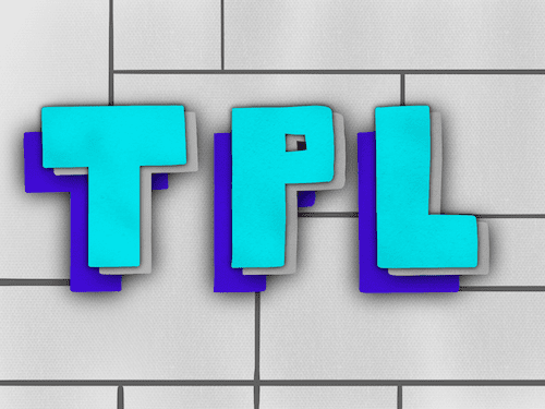
Exploring color in the original lockup and trying to imagine how it would look as podcast art. By this version, the type Orator STD seemed to have won me over but I was still trying to work out what color fit best (green and blue were wining out) and determining whether the word Productivity would be encapsulated in the black box or not. Before anything would be done there, I decided to create a logo pattern:

Why did I create a logo pattern? Because I see them on Brand New often and I was in a learning zone. I had never created such a logo in Illustrator before and I was having fun learning how to work the pen tool, playing with colors and type.
The Reality
Suffice to say, adding a design project on top of everything else was way too much for me to do. Further, the design was needed much sooner than I could do. My co-host Kyle also had a friend who does design as his day-to-day and thus, we went with a professional:

I won’t go into the details of this as I can only speak to the mood board I handed over to Adam, including the initial sketches. Adam was able to encapsulate things we wanted to capture but also keep it flexible to use on social media by bringing the background podcast art to the forefront in our templates. This is where inspiration from dutch artist Piet Mondrian shines, though we don’t fill in the blocks:

Overall, I love the final design for The Productivity Lab and I’m really glad that we had Adam take over and design our podcast art and branding materials.
Doing the initial exploration was such a blast and I can’t wait to do something like that again…likely for my business rebrand but first, I need to get back to writing!